Transparent design first appears on car brand’s i4 concept.
![]()
BMW has revealed a brand new logo to coincide with the release of its i4 concept car and yes, it’s another addition to the flat design movement. Gone is the classic black outer ring (now completely transparent), and the 3D and lighting effects have been removed to create a minimal new look. The circle design remains, as do the white and blue colours of the company’s home state of Bavaria.
We’re fans of the newly clear design. Its simplicity suggests it has been refreshed with digital in mind, but it also acknowledges the logo’s 103-year heritage – a solid example of both classic and modern logo design. Jens Thiemer, senior vice president customer and brand, says “BMW is becoming a relationship brand,” (the new Tinder?) and the transparent logo was designed to “radiate more openness and clarity”.
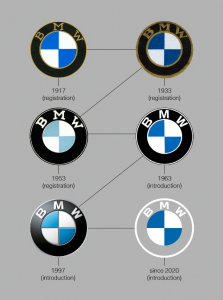
BMW has added the 2020 design to its article on the history of the logo. Seen in context (below), the boldness of this redesign is more obvious – the removal of the black ring appears to be the biggest change to the logo since its introduction in 1917.
When BMW first published the article last summer, we were particularly interested in its debunking of the common misconception that the logo itself represents a propeller. This stemmed from a 1929 ad (below) showing the logo in a rotating aircraft propeller to promote a new aircraft engine BMW was building.
“For a long time, BMW made little effort to correct the myth that the BMW badge is a propeller,” the article states, “so sticking to the story that the BMW is a propeller would not be entirely wrong”. In a world of red tape and impossibly strict guidelines, it’s nice to hear a brand suggest that its logo can be whatever you want it to be.